Huemann was tasked with naming, branding, and the full creative rollout for an industrial coffee concept tucked away on the outskirts of Leeds. With high footfall and prime access to the M62, the setting — four steel containers in a storage yard — felt anything but ordinary. The name came naturally: Vault. A nod to the heavy-duty build, the sense of containment, and the idea of something valuable hidden in plain sight.

The owners of a storage yard in Middleton, Leeds had a good plot of land just off the M62. Plenty of footfall — and a hunch that the space could be something more. They approached us with an idea: take four steel containers and turn them into a coffee concept that felt different. Not just another roadside pitstop. Something that would catch your eye, draw you in, and leave a lasting impression.
After a site visit and a strategy session, it was clear this wasn’t about softening the edges or disguising the industrial setting. The magic was already there — in the metal, the weight, the unapologetic rawness. Our job was to give it a name, a voice, and an identity that felt just as solid.
The name Vault came early. It felt obvious in the best possible way. Born from the heavy-duty containers it would be built in, surrounded by a yard of locked units, the name had an immediate presence. Clean. Cool. No fluff. Vault implied value. Containment. Protection. Something worth guarding. But more importantly, it carried that magnetic energy — the idea that what’s locked away is something you want. Badly.
Let’s face it: vaults aren’t made to be stumbled across. You know they’re there. You want in. You want what’s behind the door. That tension — between exclusivity and desire — became the foundation for the tone of voice. Vault doesn’t shout. It doesn’t try to please everyone. It hints. It plays. It builds curiosity. It’s not about coffee for the sake of it. It’s about creating something so desirable you’d consider breaking the rules just to get a sip.
That energy runs through every part of the brand experience. From secret Wi-Fi passwords and bathroom codes to the idea that you ‘break in, get what you came for, and leave no trace’ — everything adds to the myth. Vault becomes less a place, more a feeling. A short escape. A hidden ritual. A space for those in the know.
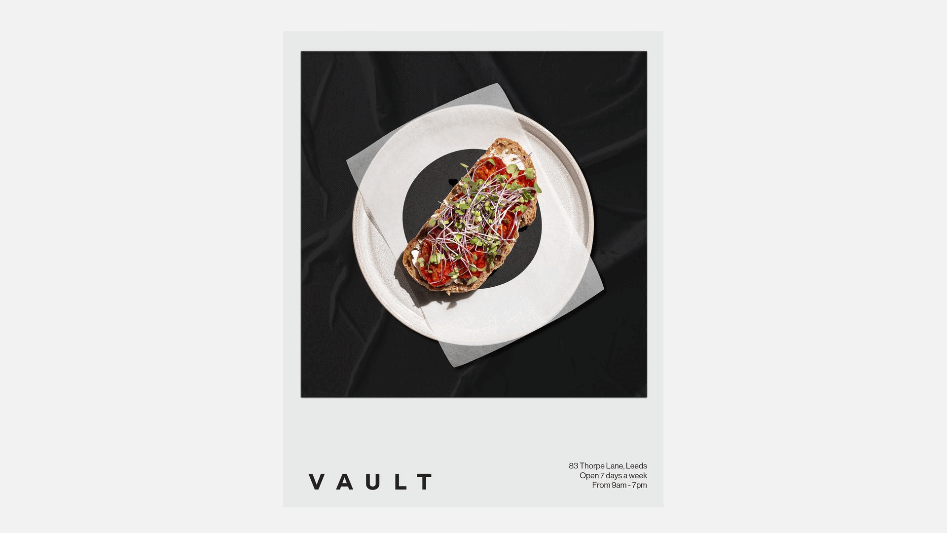
Visually, the identity holds the same weight. The logo is formed from a square and circle — a container and a vault door. Clean geometry, zero excess. Paired with a no-nonsense Swiss font and a stripped-back monochrome system, it stays grounded. Confident. Timeless. And in the same way a vault conceals its contents, the brand holds back just enough. Minimalism used with purpose, not trend.
Photography plays a crucial role too — often framed within the circular mark. Like you’re peering through the vault door, catching a glimpse of what’s inside. Whether it’s a pastry, a pour, or the glint of packaging, the product becomes the prize. A visual tease. The gold. The reason you came.
Vault doesn’t try to be something it’s not. It doesn’t need neon signs or twee quotes on walls. It has steel in its bones. Everything — from the tone to the visual language — is designed with restraint, confidence, and just the right amount of rebellion. It’s coffee with backbone. Built to stand out without ever asking for attention.
Some brands whisper. Some scream. Vault just looks you in the eye — and dares you to come closer.
Naming Strategy
Brand Identity
Brand Strategy
Packaging
Social Media
Signage
Website Design
All Marketing Collateral